This made me want to go back to elementary school again. Created by a design student, these juice boxes are a cleverly packaged to illustrate the juice that they are holding. Visually, these would be great for kids, especially at a young age and still developing various learning skills. Even the typeface, I love. It fits perfectly with the overall look of the packaging. The grunge look fits sooooo well with the design and looks as if a child sketched it in. Even the colouring ... works so well. The bright colours attract the eye and again, if designed for a child, these would be perfect
 When I saw this ... I immediately thought of the game 'Operation' mixed with a little of Mr. Potato-Head. Can you see it? I've been noticing lately that I'm tending to be attracted to designs that have flow in the form of arrows and lines. There was just something about this poster that stuck with me. Maybe it reminds me of many things and that's why I like it. There's a type poster that is almost a 'choose your own adventure' type of layout in which it asks questions and determines which font is best for what you're doing. This poster reminds me of something like that. I really don't think that it's anything in particular ... just all the little elements that make up this poster. It's fun and cute ... and it works.

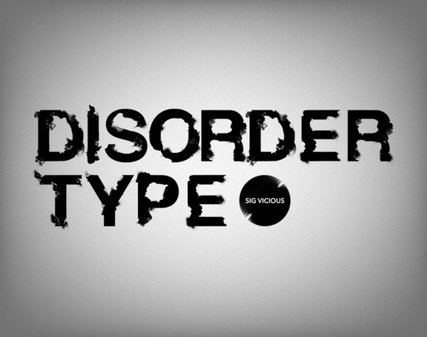
 I love love LOVE type posters such as the ones above. When designers take type and make it malleable ... it usually turns out pretty cool. There was one Harry Potter film (I think it was the Half-Blood Prince) where the ending sequence looked like black ink being dropped into water, which really got to me. Frankly, it was my favourite part of the movie (sorry, hope you're not a HP fan). With that in mind ... the above type fits into that image. It seems like a combination between ink and film being burned. Very cool combo.
http://www.behance.net/gallery/Disorder-Type/379966

Some very cool posters to check out. Much like the colours of the superheroes they represent, the illustrations are amazing and the simplicity of the design lends itself well to the heroes themselves. Check out the site for further posters!
http://www.behance.net/gallery/Superherovillain-posters/194362
 As a type nerd, I couldn't resist posting this (even as inappropriate as it is). I'm always fascinated by images made out of type and this one ... I'm speechless. I will say this however, I don't like the typeface whatsoever. Clever idea, bad type choice. I also don't like how rigid the image is ... doesn't seem to have much cohesion or flow to it. You'd think that creating such an image would involve flow. I know this was a student's creation and with a few changes ... it would turn out pretty cool. Granted, it would never get printed in North America but ... could have an opportunity in Europe?
 With the whole 3D fad in television and movies paving the way for the future entertainment, this logo seemed to stick out in matching that particular theme. I like this and I don't. It's hard to explain what I don't like about it, which is rather odd b/c I'm usually pretty articulate. Being a film girl, I'm not a big fan of 3D ... so maybe that's why this logo doesn't really resonate with me. Maybe I'm staying loyal to the old ways of film?