August 5, 2011
thoughts
I've found that this past summer has been one of obsessions. You can take that as a good ... or bad thing. I'm still unsure about it myself. I've come to start collecting design books, all sorts of disciplines in design. Very cool that I've composed this mini-library of sorts, which during the school year will act as a great resource for various projects. In some ways though, seems to be a bit excessive, especially when it comes to how much money I've spent on making this resource centre. Not being in school everyday and the lack of design projects has led me to become rather bored and "meh" with my everyday tasks. It's not the same without that creative environment that I've come to thrive on. Granted, it's my own fault. I need to maintain the student lifestyle with a job as a server and as a result, has taken up much of my time. I don't feel the desire to create or distract myself. Totally sad, I know. I've got a month left to do something with my summer. Let's hope I can get myself in gear and shape up.
May 1, 2011
A Few Tips ...

Came across this a few weeks ago and have since then ... have started making it into a poster for my apartment as a reminder. As a design student, it's important to keep perspective and these 'things' help us keep us grounded and not nit-pick at the small things.
Check it out,
http://www.jamiewieck.com/visual-essays/the-50-things-every-graphic-design-student-should-know/
April 30, 2011
Insane Ad
This video is ... very deserving of a creative award. From my understanding, it's already won a few and will continue to do so throughout this year. It was created by Y&R Chicago.
April 27, 2011
*Amazing*
 I hate PAPYRUS more than life itself ... maybe even more than Comic Sans. This is a dirty card and would find myself struggling if I were given a card with it on it. Papyrus is SEVERELY overused and I'm SICK AND TIRED of seeing spas use it. Give me a break! It's called expanding your type horizons people! What mad me even more upset ... I realized that Avatar used Papyrus for its subheadings for the native people in the film. The film should have been tossed from the Academy Awards for the sole purpose of using that terrible font. Grrr.
What Grinds My Gears

Granted I'm not a big fan of the Fast and the Furious films, but this new poster that's supposed to encourage anticipation regarding the newest film (oh yes, there are now FIVE films in the series) ... SUCKS. I'm really not liking the drop cap F and find it a cheap and non-creative way of displaying the new title. That being said, I also don't like how the F merges with the A but not with the lower I. Clearly the I would get lost if it was joined with the larger F but still ... this seems overly cheesy and to me, sets up a film to fail.
April 24, 2011
Amazing Resources
 This is a pretty cool site: www.goodfuckingdesignadvice.com
I can't remember how I came across this site but since then, it's been a great place to check out other great design sites. To add a little humour to the site, there is a 'Family Friendly' button that puts a strike through the word 'Fuck' to ensure appropriateness. Tying in design jokes and humour, the site becomes a great laugh. I've downloaded a few of their wallpapers for my own use.
April 14, 2011
Very Clever


I found these the other day and since then, have really appreciated the humour in them. This was a student created design for a condom company called INSTINCT. Seems like an adult version of balloon animals. But hey, it totally works. I *love* the type for these ads. I'm still trying to figure out what face it is. The simplicity of the animals work very well with the ad and make it central to the desired communication message. This is badass.
April 1, 2011
Cool Type

This layered type really works well and is something that I really, really want to learn how to do. I've seen some tutorials where the text is created in Illustrator and then brought into Photoshop to add the 3D effect. I think this is something that I'm going to learn how to do this summer considering we have about 4 months off. Kinetic type is also on the list of things to learn. Adding more life to text ... just makes it all the more interesting.
The above text works really well, especially with all the different layers. The colour scheme works really well too. I love the autumn tones. The colours seem to be used as layers to add depth and tone to the image. Cool.
March 30, 2011
Mad, I mean BAD Packaging

I'm a big Mad Men fan and so seeing this Season 4 DVD and Blu-Ray cover design really, really ticked me off. It seemed like it was just thrown together in Illustrator. The previous covers picked a significant object from the show and came in unique packaging. A lot of people from what I've read enjoy the clean and simple design of the cover, which to be honest ... upsets me. After doing the DVD series assignment, I've understood the significance of cohesion between all the covers. This one doesn't really seem to fit. Take a look ...


Again, It just seems to me that not as much effort went into the design itself. Considering it's a show about advertising, you'd think there would be more effort. I'm wondering if it's because the show has gone on hiatus till March 2012 that the design team got pushed back too?
March 29, 2011
Very cool packaging


This made me want to go back to elementary school again. Created by a design student, these juice boxes are a cleverly packaged to illustrate the juice that they are holding. Visually, these would be great for kids, especially at a young age and still developing various learning skills. Even the typeface, I love. It fits perfectly with the overall look of the packaging. The grunge look fits sooooo well with the design and looks as if a child sketched it in. Even the colouring ... works so well. The bright colours attract the eye and again, if designed for a child, these would be perfect
Interesting Illustration

When I saw this ... I immediately thought of the game 'Operation' mixed with a little of Mr. Potato-Head. Can you see it? I've been noticing lately that I'm tending to be attracted to designs that have flow in the form of arrows and lines. There was just something about this poster that stuck with me. Maybe it reminds me of many things and that's why I like it. There's a type poster that is almost a 'choose your own adventure' type of layout in which it asks questions and determines which font is best for what you're doing. This poster reminds me of something like that. I really don't think that it's anything in particular ... just all the little elements that make up this poster. It's fun and cute ... and it works.
Graphically Speaking ...


Creativity at its best! The branding for Germany's horror channel, 13th Street, took a whole new turn with the introduction of this new line of stationary. Strategically placed on the document, the areas in which punching or stapling are to occur, traumatized heads lay waiting. Intense, but very clever. I'd hope that these would be for inner office use ... if not, I'm sure that some form of warning may need to be attached before opening!
March 28, 2011
Toy Design


 Moody Buddy - The Mood Swinger
The friendly pal, who shows children all sides of his character and teaches them to recognize different emotions. This game which involves guessing how Moody feels by his facial expressions is fun for all the family. Little guide book included.
I came across these as I was searching around behance.net in its product design section. As mentioned before, I've started to take quite the liking to product design, especially the creative and innovative ones. This one in particular caught my attention as it is a mock-up of a children's toy, which allows the children to learn the various facial expressions of others. It's a pretty cool concept if you ask me. What's interesting is that these figures open up, acting as a holder for all the different mood stickers. I'd almost want this for myself! You know, if you're having one of those days and you really don't want to talk to anyone ... you could whip this out and hopefully the other person will get the hint! So tempting.
I really love when designer's bring their innovative ideas into the design of children's toys and learning activities. This product in a way reminds me of 'Alphabeaties,' which used type as a means of building various animals. As I grow as a designer, I really hope to bring my creativity into creating some pretty cool things for kids.
Bad to the bone ...


As gross as these may seem, I absolutely love them. My obsession with fonts is very intricate and layered. They aren't just letters or pixels, they're a means of communicating ... giving life to something. These images, although they may seem graphic, illustrate the life that the letters hold themselves. I really think people don't see the power and potential a typeface can hold over a design. When it comes down to it, the face can either make or break the design. This images are apart of a whole series in which the type are operated on, exposing the life that is within them. It's a very interesting concept, one that I very much admire.
http://www.behance.net/gallery/Evolution-of-Type-Exhibits-6-9-12/1022967
Sexy, Sexy Type
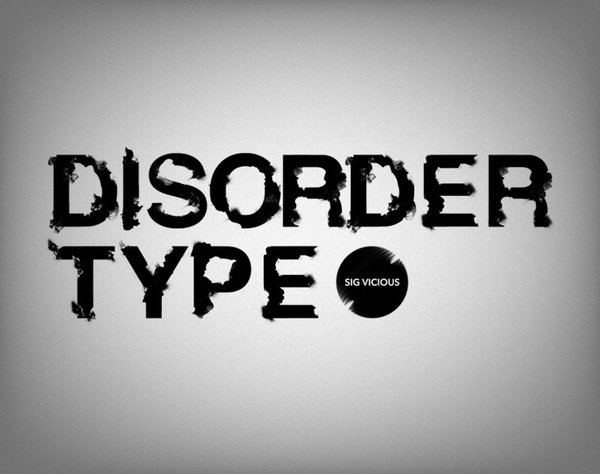

I love love LOVE type posters such as the ones above. When designers take type and make it malleable ... it usually turns out pretty cool. There was one Harry Potter film (I think it was the Half-Blood Prince) where the ending sequence looked like black ink being dropped into water, which really got to me. Frankly, it was my favourite part of the movie (sorry, hope you're not a HP fan). With that in mind ... the above type fits into that image. It seems like a combination between ink and film being burned. Very cool combo.
http://www.behance.net/gallery/Disorder-Type/379966
Spider man! Spider Man!

Some very cool posters to check out. Much like the colours of the superheroes they represent, the illustrations are amazing and the simplicity of the design lends itself well to the heroes themselves. Check out the site for further posters!
http://www.behance.net/gallery/Superherovillain-posters/194362
Text + Sex = WOW!

As a type nerd, I couldn't resist posting this (even as inappropriate as it is). I'm always fascinated by images made out of type and this one ... I'm speechless. I will say this however, I don't like the typeface whatsoever. Clever idea, bad type choice. I also don't like how rigid the image is ... doesn't seem to have much cohesion or flow to it. You'd think that creating such an image would involve flow. I know this was a student's creation and with a few changes ... it would turn out pretty cool. Granted, it would never get printed in North America but ... could have an opportunity in Europe?
A logo that I'm on the fence about ...
 With the whole 3D fad in television and movies paving the way for the future entertainment, this logo seemed to stick out in matching that particular theme. I like this and I don't. It's hard to explain what I don't like about it, which is rather odd b/c I'm usually pretty articulate. Being a film girl, I'm not a big fan of 3D ... so maybe that's why this logo doesn't really resonate with me. Maybe I'm staying loyal to the old ways of film?
Typeface Packaging

 I'm too much of a self-obsessed type geek ... these are *amazing* and would love to get my hands on them at some point ... I can only imagine how interesting they are. It gets me thinking ... it would be amazing to create a type series on some of the newer type that has been gaining attention. I've been following a type designer, Ale Paul, and even thinking about seeing his work in something like this ... just gives me chills. The examples above seem to represent older type, ones with rich history ... but expanding into a new line would again, create some very cool reads. I'm not much of a serif girl but even so, would love to have these in my expanding collection.
http://www.behance.net/gallery/TYPEFACES-PACKAGING/295858
About time ...
 I can't tell you how many times I've been politely corrected at Starbucks for not properly saying TALL, GRANDE, or VENTI. Playing off of that terminology that seems to work for Starbucks, Brooklyn Fare worked it into their design theme and playfully uses it to their advantage. The colour scheme works very well in this design as well. The white text against the bright orange background gives further emphasis to the meaning that the company is trying to convey. The simplicity of the design is what gives the product strength and to be honest, I really like it.
http://www.behance.net/gallery/Brooklyn-Fare/334380
Best thing since sliced bread!


I'm a complete school supply nerd and working at Staples all those years when I was younger didn't help either ;) So coming across this completely made my day. To be honest, I really don't know what you'd do with all those blank note books but hey, to each their own ;) It's a very, very clever and playful design, which is always guaranteed to make you smile. Even playing off of the saying 'the best thing since sliced bread,' the notebook design fits completely with its theme. Love it.
Mario World Packaging


I came across a really cool site for designers (www.behance.net), which brings together designers from all over the world to showcase their talent. One thing that would be a lot of fun to design would be a board game. I'm not a big Nintendo fan but how could I not post this? We're all used to seeing the game on the screen but to make a 3D version ... way cool.
The design for this game was well thoughtout ... even to the last detail connecting it very much with the earlier gaming system. Even the packaging that the game comes in looks like an old-school game box, accompanied with controllers. All these little touches make the game all the more realistic.
http://www.behance.net/gallery/Mario-World-Board-Game/47863
Babees Design

 I've started to appreciate the awesomeness that is packaging design. I'm known for my love of type but man ... I've really started to get into product design. I think what started this love affair was the above product. Babees Honey playfully imitates the insect itself but in a much more softer way. The soft tones used enhance the product itself and lend very well to the overall design of the product. Every detail was thought out in this design ... even the placement of the label imitates the wings of the bee. Simple and clean, the product design gives the product much more power and hold over its audiences. I *love* the type. The flow of the letters work to accentuate the feel of the product as if itself was made by the little insect itself.
Very cool.
http://www.behance.net/Gallery/Babees-Honey/49552


Interesting + Cool Packaging


Not only do these look good ... but they also TASTE GOOD too. Starbucks introduced a new line of desserts entitled Cake Pops. Playing off of lollipops, the tiny little treats are little balls of moist cake dipped in yummy frosting. What really got me about this cute little pops was the packaging that they came in. Starbucks created mini boxes that encased the pops ensuring their shape and form. These boxes also work well with the other treats that the company introduced as well. I've found though that even the boxes themselves have become quite popular as most stores revert back to the paper bags due to the boxes being sold out.
The packing design fits in with the 40th anniversary of Starbucks and as such, a new branding image arose ... clean and simple design, which dropped the Starbucks Coffee and left just the siren herself. To me, this shows the brand expanding ... becoming more than what it was before.
Designbridge.com explained it even better ...
"Starbucks have redesigned their iconic logo to coincide with their 40th birthday. The redesign aims to honour their heritage and the equities that have made up their logo for the past 40 years. The answer to the challenge was simplicity, a zeitgeist that has recently been leading the evolution of many brand redesigns (think Coca Cola, Pepsi, and Guinness).
The design is made up of both bold and subtle modifications. The brand name and wording have been removed from the mark. The green has been brought in, substituting the black, and the Siren has been removed from her porthole window. There have been subtle enhancements to the Siren itself; smoothing her hair, refining her facial features and weighing her scales on her tail in order to bring focus to her face. The end result celebrates the Siren in a much more confident way; reducing the four circles to an understated one."
Flick Off!

Brian told me to check out this campaign and to be honest ... I can't believe I forgot about this advertising campaign!! To shed light on the environment, the FLICK OFF campaign was created and with the setting of the type ... became to look like another message. Even the power symbol used as the 'O' ... resembles the middle finger. The campaign seems to cleverly 'attack' the ignorance people seem to show with regards to the environment. The type of font lends itself very well and with a quick glance, looks like a very different word. The 'L' with the shape of the 'I' are placed closely together to again, give the appearance of something else. Very cool campaign to gain the most attention.
Designers' Resources
 I came across this site while stumbling around the Internet one day and have since always gone to it to look for answers and inspiration. What's even more helpful is that the website is divided up into different sections, making it easy to navigate. Even in a pinch, this site is an amazing resource into finding the answers that the struggling designer is looking for. I haven't have enough time to actually go through everything and check out the links but after quickly browsing ... it's an *amazing* resource. Can't wait to try it out in the future.
Take a peek!
http://www.designerslist.info/
Alphabeasties

I came across this book last term when I went to the type show at the North Campus. Since seeing it, it has inspired me in a number of design projects that I've worked on this term. What was even better, we were asked to design our very own alphabet book and immediately ... I came to this book for inspiration. Each letter was carefully created to look and even FEEL like the animal they are representing. To make it more interactive, some of the animals fold out into larger and more intricate beasts.
'Alphabeasties' was written by Sharon Werner who successfully mixes the art of typography and design into book not only for children. After seeing this, I bought the book and even when I need a good smile ... I go to this book. Amazing :)
Design Police - If only ...

One of my profs showed this to me today and wow ... my mouth dropped. It's one of those instances that you wish there was something like this that you could purchase and put into use. I've been finding myself lately looking at how companies around downtown Toronto brand themselves and man ... I totally need these stickers!! It would be amazing to poster print some of these and just run around putting them on all the bad design roaming the streets of Toronto. It amazes me to no end how much people don't really take into consideration the power of design. This might help ;)
From the website, you're able to download the free file and have fun with it. It contains roughly 5 pages of designer criticisms, which playfully attack the bad design that lingers. I was immediately drawn to the type labels and would absolutely love to have some fun with them.
Check 'em out!
http://www.design-police.org/
Funky Font on Website
 I'm really not a fan of outlined text. To me, doesn't look as sexy as a solid sans serif. In this particular case ... I actually really like it and finds that it adds well to the site design. It's simple and playful, which is something that the type conveys perfectly. When I think of an ad agency ... I think Don Draper-esque people who like sleek and sexy designs. This ... this seems to be the opposite, but ... it totally works. As the website says, they aren't some run-of-the-mill agency and so ... makes complete sense that they go about advertising themselves much differently. Even the jargon works to showcase the agency as something unique and playful.
Check out the site, it's pretty awesome!
http://www.project365.co.uk/
Best Burgers + Branding


My trip to Vegas was amazing ... but what was interesting ... was this burger joint we came across in our travels. Dubbed Kerry's Gourmet Burgers, the restaurant played off of a Russian theme and went by KGB. What was amazing about this place was its branding and overall look and feel. Located only in Vegas, this restaurant took the brand right to the menus, which displayed a grunge-like look with a cartoon twist. Not only did the place look amazing, the burgers were even better ... so good we even went back two more times just so we could check more of the place out.
The font on the menu is pretty awesome too and fit amazingly with the overall theme of the restaurant. I'm not a big fan of block lettering like that but with this particular design, lends itself very, very well.
Subscribe to:
Posts (Atom)