February 27, 2011
Last Poster (I Promise)
This was another type poster that I came across tonight and really thoroughly enjoyed. Again, I'm a sucker for type posters and this one really stuck out. I really, really, like the colour scheme as it plays nicely with the primary and secondary colours on the colour wheel. It's simple and clean-cut design allows for the evolution of type to truly come out. I really wish that I had more walls in my apartment to post this. Rather, I'd love to find an actual print of it online. Girls have problems with buying shoes, I have problems with type posters. I'm ok with it though, I think it will act in my favour later on in my career ;)
Type Table
How could I resist posting this?! I came across this tonight when I was aimlessly searching the internet for type news (lame, I know). Playing off the Periodic Table, this typeface table playful labels the older and established faces based on their name and appearance. Even when you're searching for a typeface, inspiration can be drawn from posters such as these. I'm a more modern girl but even then, I can still look to this table as a means to generate some type ideas.
More Sexy Posters
This is another poster that I have hanging in my apartment due to its 'font humour.' I'm a sucker for type jokes so this one really made me laugh. I even tried to recreate it just to play with the type itself. I'm usually not a fan of serif fonts (I'm more of a sans serif girl), but this ... this is very cool. I've seen multiple versions of this on the internet but this one seemed to be the nicest version. I'll even admit, I've seen t-shirts with this on it and no, I didn't buy it. I was tempted ... but ... might be pushing it (just a little).
Sexy Type Poster
I came across this poster months ago and as a result, it's been hanging on my wall in my apartment ever since. A lot of people know that typography is my weak point or rather my obsession in design. Since we've been using letters to create images lately, figured this would be a good posting. I love that the letters fit so nicely together that form the weapon as well as the very literal 'bang' that accompanies it. It's simple and clean, two things that I very much appreciate when it comes to type design. It just gives me such a smile when I see this poster hanging up.
February 25, 2011
What is Typography?
This is probably one of the best examples of kinetic typography I've seen but also, one of the coolest videos describing type lingo. I love it, there's no other way to put it. It's as if my love of type could be made into a video. What I like most about it is its playfulness as well as visually explaining and showing the significance of type design. The old-school feel to the video is also a nice touch to it.
Web Design
In the past, I've kinda been against website design opting more for print-based design. I'm not sure what in particular I didn't like about website, there was just *something* that wasn't the same. I'm more of a tactile person so I think touching and seeing the final product worked better for me. However, I'm coming to realize that I'm going to need an online presence in order to establish myself as an up-and-coming designer. I vowed that I would never make my presence online bigger than it had to be but lately, I've tried to see the benefits of moving myself online. I succumbed to Twitter, yes, Twitter to "re-tweet" designer information as well as to establish myself. The thing is though, the more I look into website design, the more I kinda like it. It has the ability to be creative as well as interactive. I really hope that throughout this two-year program that we learn how to work with as well as create websites. As students, again, we're encouraged to put ourselves as well as our portfolios online so thus, would prove to be a beneficial learning experience.
The two examples above are great at displaying the creative and playful nature websites can possess. The colour combination in both websites work very well and fall into the colour palettes that I'm into lately.
February 21, 2011
Finally!
I'm sooooo happy!! I found this article that will truly allow me to learn so many cool and badass techniques when playing with type. I'm getting more confident with Illustrator but it never really occurred to me that after creating cool type in Illustrator, to move it into Photoshop to give it some cool aftereffects. The article mentions some other programs that I've never heard of (Inkscape, 3D Studio Max), which would be cool to explore later on. What makes me really happy is that one of the tutorials shows me a step-by-step guide to making portraits out of text. FINALLY! I'm so excited to try this out and see what I can come up with. My friend has been playing with it in Photoshop but to no avail. Let's see if I can beat him to the punch and create something badass.
Thinkin' ahead
So we have to design a DVD cover for a Hitchcock film and having seen this particular poster, I immediately thought of Saul Bass ... the gentleman who design a number of title sequences for some of Hitchcock's most popular films. Seeing this reminded me of "Vertigo," and could work very well for a cover design. Playing with the text and the silhouette of a man could fully illustrate the significance of the film. I'm not sold on the colour scheme above but that's something I could work on for my DVD cover. Brown and black don't always work well together and I think in this case, it doesn't. I think this really gives me something to work with for my cover. Although I wanted to stick to some of his lesser known films, designing a cover for "Vertigo" would be pretty cool to do.
Very cool poster
I found a new design blog (http://blog.reflexstock.com/) and since then, I've spent hours on it just checking out all its articles, images, etc. The creator seems to have a passion for typography and so, its articles are very, very interesting. I came across this particular poster and fell in love instantly. I'm not sure if it's the colour scheme or rather the use of sans serif ... there's just something about this poster that I really do enjoy. Incorporating type into the shape/image of the poster is what truly intrigues me. I love the flow of the "I" ... so sexy! Even the saying works well with the type.
Sudtipos
This has to be one of the coolest type foundries out there. Based out of Argentina, it is run by 4 unique and pretty interesting guys from different corners of design. Mostly creating type for branding, Sudtipos has become world renown for its creation of script type as well as digitizing older script fonts from earlier in the century. I learned about this foundry from Alejandro Paul, one of the founders of the company. His work has truly influenced me into using more script-based fonts for my material that I'm working on. As as font girl, I go through phases and have never really gotten into script fonts before ... until now. Thanks to another teacher, I've been given some of Paul's fonts and since then, have been using them non-stop in a variety of different mediums. Paul is very interactive with his fans and has also been in contact with me about gaining more information about his typefaces.
Check out www.sudtipos.com for more information!
Another Obession
Other than type, I have a *big* thing for sexy business cards. Especially in today's competitive world, you need to have some form of advantage that allows you to stand out from others ... how do you do that? I say ... sexy business cards. Offering a first impression that's bound to last, the business card is a great means to get all your information across as well as create some intrigue with possible employers and clients. For years, I've been collecting well-designed business cards as well as books that highlight interesting and unique cards from across the world. Even for a simple design idea, skimming through those books gives you that look or feel you were searching for.
I love the cards above. They are playful and add a little bit of *something* to the card in order to make it stand out from the rest. I designed a card about 5-6 years ago that left an opening in the card so that people could look through it with a tag line of "it's how you look at it." It's a really interesting concept and I think gives the card more of an interactive feel to it. The card above works well due to the popularity of the mustache that seems to have swept over popular culture. It's sexy and boy, does it work.
February 20, 2011
Adding to the list ...
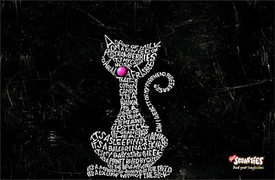
Filling outlines with text has come to be one of my top "learn how to do" items lately. Even in classes, I'm finding that making objects out of text has become a theme, which makes me very happy as it's something that I really, really want to learn how to do. Even the example above from Smarties, manipulates text to create a funky-looking cat while emphasizing the pink Smartie for the nose. I know text manipulation will work best in illustrator ... it's just finding out "how". I know in some images, the text isn't tweaked but rather the shapes of the letters are used to create an image by stacking. I've found that I've become comfortable stacking, it's just moving onto the next step of manipulation. I'm assuming it's fitting text to outline but again, just gotta figure out how and finding the time to actually do it. This is will be on my list this coming summer when I have a little more time to play with the programs.
Branding Power
I took some business in university and really came to love marketing. I eventually switched out of business because I felt my creativity wouldn't really fit in and I wouldn't be able to really push myself in that particular area. However, having taken some classes, I am now able to see the branding power and influence that companies (and designs) can have over audiences. Logos have become the visual essence of the company and as such, must match the philosophy laid out by the company itself. It has to match perfectly or else confusion and/or brand confusion can arise.
I came across this website that really goes into the power and significance of logo design and the importance of matching brand and image:
http://www.graphicdesignblog.org/brand-more-than-logo/
I went there ...
Katrina and I did a project for another class where we had to examine and re-pitch an award-winning ad campaign. We work very well together and decided to pick Viagra and play off of its already established humour. I remember when these commercials came out over a year ago and were piggy-backed against one another as a means to stay in the minds of the consumer. Toronto's Taxi created four different spots outlining stereotypical leisure activities older couples use as a means for sex substitution. The ads resulted in a hilarious spot featuring men complaining about their strolling, reading, home decorating, and antiquing addictions. The more research Katrina and I did on the commercials, the more we began to appreciate the humour that the videos were trying to instill. Previously, Viagra had targeted men alone with a tag line of "Talk to your doctor," but with these new ads, the topic of ED didn't have to be such a taboo subject in society. The ad was appealing to both men AND women ... the duality of the commercial is what separated it from its competitors such as Cialis and Levitra. We presented the "Confessions Campaign" with great success and allowed both of us to have a little fun at poking fun at the guys in the class.
What Should a Logo Cost?
I'm usually really good about keeping up with design news, especially when it comes to logo design and I came across this interesting article regarding the cost of redesigning company logos. I was *appalled* by the costs for some of them ranging up to $136 million dollars. I understand the significance of branding, etc but for a logo redesign to cost that much?! Ridiculous! Some of the designs after all the rebranding were simplified and to be honest, didn't look as good. I still couldn't get over how much companies spent on changing their looks.
Check out this website for further pricing as well as the other company logos that got changed around ...
http://www.logodesign.com/?p=549
Check out this website for further pricing as well as the other company logos that got changed around ...
http://www.logodesign.com/?p=549
More Kinetic Type
I could NOT NOT put this video up. It's bright colours mixed with kinetic typography ... plus, a pretty cool song = one pretty cool video. A friend showed me this video and since then, I have to play it at least once a week. The sans serif type and playing with the hierarchy allows this video to have a pretty interesting appeal. Visualizing the words themselves gave greater meaning to the song too. It's just an overall fun and playful video :)
Kinetic Type
Feel like I'm going to go on a bit of a type-roll with my next few posts. In class one day when I should have been paying attention, I came across this video on YouTube. First of all, American Beauty is one of my favourite movies and mixing that with type, it was like a dream come true. Working with the final speech of the film with Kevin Spacey, the type moves and flows giving greater meaning to the words. Visually showing gave me greater appreciation for both the film and type. It's just one of those things that I'd really like to learn how to do. Creating my own kinetic type ... I'm adding it to my never-ending list of things I'd love to learn.
This makes me happy
I was asked to research a type designer who I admired and through this process was introduced to Alejandro Paul, a designer working out of Argentina. His work focuses primarily on digitizing script fonts and as such, has become world renown due to his typefaces. His intricate work with ligatures and swashes allow his faces to be very useful for packaging design. Forming a Argentina's only type foundry with four other members, Sudtipos has become the go-to place for amazing script fonts.
I'm a big fan of typography in motion. Through this means, we're able to fully understand the playfulness of the type as well as its connotations. Researching Paul on YouTube, I came across this interesting video featuring Sudtipos' new face: Brownstone. With the accompanying music, the font stands alone to show its features and the uniqueness as a font. It really put a smile on my face :)
February 14, 2011
Wow.
Some times advertisers get it just right. I was introduced to this commercial through a friend and since then, I can't get over how clever and playful this commercial is. Being a little bit of a Star Wars fan (just the originals - not the overly done pre-quels), it was great to see the interaction between the two. You're looking at a film that transcends generations and as such, this commercial plays off of that. It's cute and simple, to the point.
Subscribe to:
Posts (Atom)